카테고리 없음
파이썬 데이터 분석 코드 북(제4장 데이터 전처리 2)
pgh95319
2023. 1. 23. 22:41
제4장 데이터 전처리 2
6. 차원 축소
- 주성분 분석 과정
# 데이터를 설명할 수 있는 변수가 많아질수록 좋은 것은 아니다. 오히려 알고리즘의 성능이 저하되는 현상 -> '차원의 저주'
# 분석에 사용할 변수를 줄이는 방법에는 1. 종속변수와 상관관계가 높은 설명변수, 2. 주성분 분석(PCA) 등이 있다.
# 주성분 분석 과정
import pandas as pd
from sklearn.datasets import load_iris
from sklearn.preprocessing import StandardScaler
# 1. 데이터 정의
iris = load_iris()
iris = pd.DataFrame(iris.data, columns = iris.feature_names)
iris['Class'] = load_iris().target
iris['Class'] = iris['Class'].map({0:'Setosa', 1: 'Versicolour', 2:'Virginica'})
# 2. 수치형 데이터만 추출 후 정규화
x = iris.drop(columns = 'Class')
scaler = StandardScaler().fit_transform(x)
pd.DataFrame(x).head(3)
# 3. PCA분석
"""
from sklearn.decomposition import PCA
pca = PCA(n_components = int) 생성할 주성분의 개수
pca_fit = ppca.fit(x)
print(pca.singular_values_) -> 전체 데이터에서 해당 주성분의 개수로 설명할 수 있는 분산의 비율
print(pca.explained_variance_ratio_) -> 전체 데이터에서 각 주성분이 설명할 수 있는 분산의 비율
"""
from sklearn.decomposition import PCA
pca = PCA(n_components = 4)
pca_fit = pca.fit(x)
print(pca.singular_values_)
print(pca.explained_variance_ratio_)
# 4. Screen Plot으로 사용할 주성분의 개수 정하기
"""
import matplotlib.pyplot as plt
plt.title("Screen Plot")
plt.xlabel('Number of Components')
plt.ylabel('Cumulative Explained Variance') -> 누적 그래프가 아닌데, 참고자료 오타인듯하다.

plt.plot(pca.explained_variance_ratio_)
"""
import matplotlib.pyplot as plt
plt.title("Screen Plot")
plt.xlabel('Number of Components')
plt.ylabel('Explained Variance_ratio')
plt.plot(pca.explained_variance_ratio_)
plt.show()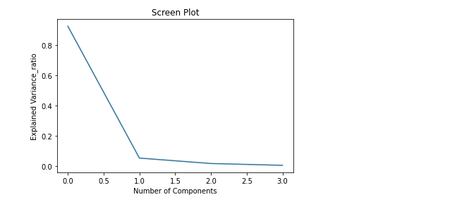
# 주성분이 2개가 될 때 설명력 증가량이 급격히 감소하므로 주성분 1개 적절하다고 판단할 수 있다.# 5. 정해진 주성분 개수로 새로운 데이터프레임 확인
'''
n_components = 1로 설정하여 다시 pca_fit하여 데이터프레임을 만들 것이냐(참고자료) vs 주성분 개수 정할 때 사용한 n_components = 4일 때 pca_fit으로 만든 첫번째 주성분의 데이터로 데이터프레임을 구성할 것이냐(나의 생각)
전자는 pca분석한 데이터셋이 새롭게 다시 구성되기 때문에 주성분 개수를 정할 때 pca분석한 데이터셋, 주성분 설명력 등 모든 지표들이 달라진다.
n_components=1일때 다시 구한 주성분들이 최적의 설명력을 보장할 수 있는 주성분인지 보장할 수 없게 된다.
그러므로 후자로 주성분 개수를 정할 때 사용한 pca_fit로 구성한 데이터셋의 첫 번째 주성분을 데이터프레임으로 사용하는 것이 적절하다고 판단된다.
'''
principal_iris = pd.DataFrame(pca_fit.fit_transform(x), columns=['pca1', 'pca2', 'pca3', 'pca4'])
principal_iris2 = principal_iris.loc[:,['pca1', 'pca2']]
principal_iris2 # 주성분 산포도 그래프를 위해 주성분 2개로 데이터프레임 구성. 본래는 하나로도 충분하다.
- 주성분 산포도 확인
# 주성분 산포도 확인
import seaborn as sns
import matplotlib.pyplot as plt

plt.title('2 component PCA')
sns.scatterplot(x = 'pca1', y= 'pca2', hue = iris['Class'], data = principal_iris2)
plt.show()

7. 데이터 불균형 문제 처리
"""
데이터의 불균형 상태에서 소수의 이상 데이터를 분류해내는 문제는 정확도 손실이 크다. 모두 비정상 데이터라도 정확도가 90%이상 나올 수 있다.
이를 해결하기 위해 제시되는 방법으로 소수의 비정상 데이터의 수를 늘리는 1. 오버 샘플링
상대적으로 많은 정상 데이터에서 일부만 사용하는 2. 언더 샘플링
2가지 방법을 주로 사용한다.
"""
- 언더 샘플링
# 언더 샘플링

# imbalanced-learn 모듈 설치해야, 시험장에서 설치 가능한지 확인
!pip install imbalanced-learn
# 1. 95:1의 불균형 데이터 만들기
import numpy as np
from sklearn.datasets import make_classification
from collections import Counter
from imblearn.under_sampling import RandomUnderSampler

x,y = make_classification(n_samples=2000, n_features=6, weights = [0.95], flip_y=0)
print(Counter(y))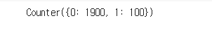
# 2. Random Under Sampling
undersample = RandomUnderSampler(sampling_strategy = 'majority') # sampling_strategy = 소수 레이블의 데이터 수 / 다수 레이블의 데이터 수, 'majority'는 다수 레이블의 데이터를 샘플링하여 소수에 맞춤.
x_under, y_under = undersample.fit_resample(x,y)

print(Counter(y_under)) # {0: 1900, 1: 100}에서 {0: 100, 1: 100}로 데이터 비율이 같도록 샘플링된 것을 확인할 수 있다.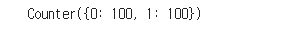
- 오버 샘플링
# 오버 샘플링 -> 언더 샘플링과 달리 데이터를 단순 복제하기 때문에 분포는 변하지 않지만 그그 수가 늘어가 오버피팅의 위험성이 있긴 하다. 불균형 문제 처리가 급할 시 사용.

# Random Over Sampling
from imblearn.over_sampling import RandomOverSampler
oversample = RandomOverSampler(sampling_strategy = 'minority') # 'minority'는 소수 레이블의 데이터를 복제하여 다수에 맞춤.
x_over, y_over =oversample.fit_resample(x,y)
print(Counter(y_over)) # {0: 1900, 1: 100}에서 {0: 1900, 1: 1900}로 데이터 비율이 같도록 복제된 것을 확인할 수 있다.

- SMOTE(Synthetic Minority Over-Sampling Technique)
# 오버 샘플링 SMOTE 방법
# 소수 레이블을 지닌 데이터의 관측 값 대한 K개의 최근접 이웃값(KNN)을 찾고 관측 값과 최근접 이웃값 사이에 임의의 새로운 데이터를 생성하는 방법이다.
from imblearn.over_sampling import SMOTE
smote_sample = SMOTE(sampling_strategy = 'minority')
x_sm, y_sm = smote_sample.fit_resample(x,y)
print(Counter(y_sm)) # {0: 1900, 1: 100}에서 {0: 100, 1: 100}로 데이터 비율이 같도록 샘플링된 것을 확인할 수 있다.
- 원본 vs 언더 샘플링 vs 오버 샘플링 vs SMOTE 산점도 비교
import warnings
warnings.filterwarnings(action='ignore') # 경고 무시할 때 사용

fig, axes = plt.subplots(2,2, figsize=(10,10))
sns.scatterplot(x[:,0], x[:,1], hue=y, ax=axes[0][0], alpha = 0.5)
sns.scatterplot(x_under[:,0], x_under[:,1], hue=y_under, ax=axes[0][1], alpha = 0.5)
sns.scatterplot(x_over[:,0], x_over[:,1], hue=y_over, ax=axes[1][0], alpha = 0.5)
sns.scatterplot(x_sm[:,0], x_sm[:,1], hue=y_sm, ax=axes[1][1], alpha = 0.5)

axes[0][0].set_title('Original') # axes.set_title() vs plt.title() : 전자는 subplots를 그리고 axes별로 title지정이 가능하다. 후자는 하나만.
axes[0][1].set_title('UnderSampling')
axes[1][0].set_title('OverSampling')
axes[1][1].set_title('SMOTE')

plt.show()